Tuesday, October 26, 2010

Week 9 Blog Exercise – Dimension/Depth/Space

Greetings user, it has been a while. Welcome back to the world of TRON

http://www.filmofilia.com/wp-content/uploads/2009/09/tron_legacy-535x535.jpg

Let me start by saying I am in no way tied to Disney. My shameless promotion of this film is purely as a fan. I am also a motorcycle rider and the TRON cycle below just makes me giddy with glee when I see it in action.

http://www.filmofilia.com/wp-content/uploads/2009/07/tron_legacy-2.jpg

If you like, please click the YouTube clip below and enjoy some of the musical stylings of Daft Punk while you read my blog post.


People like to trash talk Disney for being one of those studios that are more about cranking out generic art for the sake of more market share then making something that can truly speak to our dreams. Usually I am also one of those people, but in this case I'll make an exception.


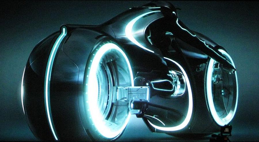
http://cache.gawkerassets.com/assets/images/9/2010/02/tron_legacy.jpg

I loved the original TRON and this new one looks like it will be the coolest one yet. As an DAI interdisciplinary major, I find many aspects of industrial design of interest. This film incorporates all of the Dondis elements of dot, line, shape, direction, tone, color, texture, scale, dimension, and movement. Film and graphics provide the biggest range of implementation of these elements. As a designer, having the ability to play with all of those different tools is the ultimate in creative expressiveness.


http://thefilmstage.com/wp-content/uploads/2010/04/tron_legacy2.jpg

This frame above I think is a good example of dimension, depth, and space. The cables and rails of the suspention bridge converge toward the vanishing point on the horizon to give a sense of linear perspective. The the man in relation to the size of this large bridge uses the visual cue of relative size to make him small and the bridge seem big. His relation to the horizon use the visual cue of relative height to make him appear closer.


http://www.screenhead.com/wp-content/uploads/2010/08/TRON_Billboard.jpg

The picture above I think would make a good Avatar for Jane.

If you are interested, you can find out more at:

Tuesday, October 19, 2010

Week 8 Blog Exercise: Tone and Color

Here is some album art from one of my favorite bands "Tool." Not only is their music incredibly cool so is their use of imagery. In the music business it is important to not only sound good but to create a dynamic visual presence on stage, in videos, and in packaging of marketable items such as shirts, hats, and other items that help to promote the band.


TONE
https://blogger.googleusercontent.com/img/b/R29vZ2xl/AVvXsEhFXVDHHP78AU5uzcFJaO83tzVJKxBsLVm-DfgUt76hfsG0wCZKMBRPQErdbbQzlfpXvzSA1AIkgEevozm2kjEqamYk_yGGrBLB1uOn5-ZoHHXXKduiL3yrOJ1iTWKeHGuVcNC8eIMClk4/s1600/collective.jpg

TONE - In this image with a translucent veiny man with his head on a pillow, the tonal values are almost in the middle of the spectrum giving the pink and purples a soft muted effect to his bed and skin. In the background the repeating SHAPE of eyes can be seen. The tunnel of eyes behind the head starts out in dark tones. The higher up the wall of eyes the more the tone lightens eventually leading into pure point of light.


Side Note
https://blogger.googleusercontent.com/img/b/R29vZ2xl/AVvXsEiJKyVxHxJ-b47ROoC3yJoOwRiwX9Re7jSA41aqR68Vf5IMseeYhhcKZpBSZSCmEH9LkWQIQVd0LlEjA2fQRgBDSk1-6p5RhWoyOPXH303GcaxXc73YUMHyczLYKE8IofUyKvJvW7oqnW4/s1600/net3.jpg
The picture above reminds me of the gestalt principle of multistability or multistable perception in the way it pops back and forth between two forms, much like the classic example of the two faces that are also a vase. Dondis refers to this in Chapter Two when discussing positive and negative space. The form in the center reminds me of an enlighten figure sitting in a meditative pose. I know that observation is not really part of this assignment but I thought it was an interesting side note.


COLOR

https://blogger.googleusercontent.com/img/b/R29vZ2xl/AVvXsEiXZjau1VNpFiF0Ry1XReh5xJb2POMnBFGwJRAEukLpRQnzdpIO9cn5NvipLp8_8eaJnbWQx_y56HBxWHOFYip14TYe0RsWo5HBKdBTMaonSN02L4-d-kHTFUc_hhk7biMhssIX86oUNFI/s1600/Reaching_color_low.jpg

COLOR - This last picture has a glowing human figure rising through the clouds as spiral LINES are being spun away from the center by a serpent of fire. More LINES emanate from the heart of the body and are attached to the LINE drawn by the spiral. The primary colors of Red, Yellow, and Blue, like those found in the SUBTRACTIVE MIXING (RYB MODEL) create a very dramatic impact. Dondis points out that color can be highly emotional and symbolic. The dark clouds provide a great background to highlight and contrast the incredible energy of the scene. The fire is crackling with intensity and life. Is the figure is reaching to the heavens? Toward knowledge? Why is there a serpent? Is this forbidden knowledge the spirit inside is reaching for?

Tuesday, October 12, 2010

Product Design

Week 7 - Active Elements

One professional area that interests me is product design.


http://www.bikefurniture.com/imagebfd/lcvRedpads21ws2.gif

This chair uses the element of shape. The shape it executes most inventively is the circle; not just any circle however, but the spokes, rims, and wheels of bicycle tires. By attaching these spare parts together and adding a couple cushions the artists has re-purposed these items to form a really cool looking chair.


http://technabob.com/blog/wp-content/uploads/2008/10/quinmain2.jpg

This lamp employs the element of tone. Tone is the intensity of light or darkness in anything we see. Tone is active in and around the lamp. The design of this lamp is a swilling dodecahedron with a coral-like pattern of holes. The body of this form is a beautiful geometric orb reminiscent of a starfish or an octopus. The light that is emanating or blocked by it, casts intricate visual patterns that create a fascinating environment around it.


http://www.impactlab.net/wp-content/uploads/2009/05/clock10.jpg

These
kinetic wall clocks use the element of movement. Movement is one of the most dominant visual forces in human experience. Not only are these clocks smooth sculptural timepieces crafted in rich and warm colored woods, but they captivate the viewer with its fluid motions. Movement helps propel the machinery that drives it toward its more utilitarian purpose. Often it is a simple purpose that moves an artist to create something that truly transcends that original purpose.

Tuesday, October 5, 2010

Week 6 Blog Exercise - Design Success and Failure in Relation to Syntactical Guidelines


Here is one of the chairs shown from our lecture last week. The lecture was conducted by our substitute Professor Hsaio-Yun Chu. The chair appears out of balance. It lacks a solid place for ones behind to rest properly onto its surface. In that regard, it fails as a chair. The way it hangs out so far from the base places stress on its form. The chair called, "Empty Chair" while an intriguing exercise on the use of positive and negative space, does not seem very functional as a chair.


The successful example shown in class was this chair. It's egg-like form has a nurturing allure. Where the other chair only played with positive and negative space, this chair successfully executes the concept smoothly and with grace. The sitting surface dips into its core allowing for the person sitting in the chair to become level to its center. This is an interactive leveling experience that visually invites one to sit on this comfortable looking object.