Saturday, December 11, 2010

Week 15 Blog Exercise - Interactions Between the 3 Levels

Cycle tracks will abound in Utopia. ~H.G. Wells


Industrial Design Rendering - Bicycle


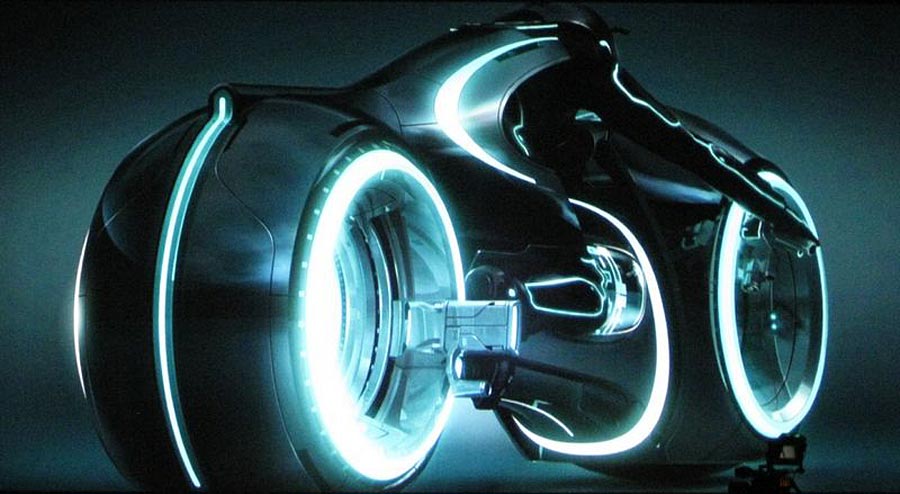
Here is an industrial design rendering of a bicycle by designer named Scott Robertson who has a passion for designing bicycles. I choose this picture because I really like bicycles. I think bicycles are an excellent form of transportation because they don't use fossil fuels; they promote an active lifestyle by burning calories; they are one of the most quiet, peaceful and enjoyable ways of seeing the world around us. For these reasons I would like to design my own bike someday.


This design is representational because it appears to the eye to be real even though it is not. The role it plays is to be a mode of transportation. The use of lighting details sharpen the form to create a vivid impact. It relates to the abstract much like how tools are made in a form to serve the intended purpose. It relates to the symbolic in that it shape seems to denote movement and speed.


This abstract design distills the essence of a bicycle within its collection of shapes, curves and contours. The role those aspects play to are make a modern looking structure. The impact is a futuristic feeling form. It relates to the representational by implementing very realistic touches of natural color to give the impression of true lighting. It relates to the symbolic in that it's abstract shapes and angles of the frame refer to a sturdy structure.


This design is symbolic of all bicycles in that it remains true to what we have come to expect from the visual pattern commonly found within any bike. The role this symbolism plays on our imagination by building on what we already know about bicycles. By employing the symbol of a bike, this design creates a powerful impact by stirring ideas within those familiar with riding, a sense of what it would be like to travel on it. The relates to the abstact by appealing to the underlying utiliarian use for a bicycle. It relates to the representational in that it's design is clearly puts together a picture that stands for bicycle.


A couple quotes (I like quotes :)

It is by riding a bicycle that you learn the contours of a country best, since you have to sweat up the hills and coast down them. Thus you remember them as they actually are, while in a motor car only a high hill impresses you, and you have no such accurate remembrance of country you have driven through as you gain by riding a bicycle. ~Ernest Hemingway


When man invented the bicycle he reached the peak of his attainments. Here was a machine of precision and balance for the convenience of man. And (unlike subsequent inventions for man's convenience) the more he used it, the fitter his body became. Here, for once, was a product of man's brain that was entirely beneficial to those who used it, and of no harm or irritation to others. Progress should have stopped when man invented the bicycle. ~Elizabeth West, Hovel in the Hills

Monday, December 6, 2010

Week 14 Blog Exercise - 3 levels of visual meaning

Representational

This bar barrows from a concept we recognize from our environment and is meant to be representational of a tiki hut. Many people understand it refers to the experience of being on the beach. It reports large amounts of detail about the materials found in tropical places such as bamboo, driftwood and and palm leaves. While sipping on exotic tropical flavored drinks with little umbrellas one might imagine themselves in a place far away from the everyday concerns of a busy city lifestyle.


Abstract

Here is an abstract piece that contains many of the elements and forms found in a bar. Vivid and lively colors distill the experience by expressing the music and excitement in the atmosphere. Even though it is a painting, it captures the motion and pace of nightlife with it's use of echoing patterns and rhythmic waves.


Symbolic
Perhaps one of the most recognizable symbols for a bar comes in the shape of a martini glass. Such a simple and elegant form, it has come to denote the concept of a cocktail lounge and all of it's associated nightlife. This symbol is iconic in the since that it uses representational information in order to communicate it's meaning.

Tuesday, November 16, 2010

Week 12 Blog Exercise / Visual Techniques

One of the areas of design I am very passionate about is green technology.

Below is a device that allows you to charge a usb appliance using the energy that you generate while riding a bike.
Descriptive Words:
Depth
Balance
Mechanicalness
Asymmetry
Economy


Next is a window blind design that absorbs solar radiation during the day and provides light at night with the stored energy.
Descriptive Words:
Regularity
Symmetry
Unity
Harmony
Simplicity


The two designs are both have been created with energy conservation in mind. The first was a device that has a compact and economic form so not to be too bulky for a bicycle rider. The window blinds are a simplistic idea: if you have to cover the window from the sun, why not get the benefit of the energy instead of wasting it? Both create a sense of depth. The bicycle unit while mechanical in nature, is asymmetric while still maintaining a feeling of balance. Each window blind is in unity with the other to make a regular pattern of blinds. This pattern gives harmony to the window and lends to a calming effect in eye of the observer.


Tuesday, November 9, 2010

Week 11 Contrast Blog Exercise

Lately I have found the online TED conferences to be a great way to hear really intellectual and inspiring speakers. Last time I visited the TED website, I was struck by a guy named Seth Godin who is an entrepreneur and blogger who thinks about the marketing of ideas in the digital age. In his speech he talks about his website, "This is Broken." For the full talk go to: http://www.ted.com/talks/seth_godin_this_is_broken_1.html I have used a couple of the examples from his TED talk slideshow to illustrate the good and bad uses of contrast.

Example 1: Effective use of contrast in Design
The example above humorously contrasts the attention of the dog to that owner. Its nice that the authorities in Vancouver have decided to take this approach. The place in the background is beautiful. Signage that normally would take away from the serenity of this scene instead lends to it's charm.


Example 2: Poor use of contrast in Design

What was this guy thinking? This shows a broken design in action. The important information "that the bridge is out ahead" is in small print, while the "sharp edges" of the sign seem to be where the major emphasis is being placed. The contract between the largeness of the text describing the sharp edges and the small text about the bridge does not communicate where the true danger lies. Contrast is suppose to alert us to what is important. If one uses it in counterintuitive ways they risk being misunderstood.


Tuesday, November 2, 2010

Week 10 Navagation Blog Exercise


Navigation

As a visual designer its important to see the big picture and be able to convey that knowledge in a clear and precise way. Below are a couple examples to demonstrate this.


Navigating our complex transit system
http://mappery.com/maps/San-Francisco-Muni-Metro-map.mediumthumb.gif

Finding one's way around an unfamiliar city can present a challenge. The best way to navigate through a big city is to use a map. A straight forward map that is exactly to scale can be even more daunting then just asking someone for directions. The San Francisco Muni System has condensed the map to its most essential information so that if one knows where they are and where they want to go, they can quickly and easily tell how to get around.

Navigating a large website
http://www.treehugger.com/

Navigating a website can also be very confusing. Because of my interest in green design I decided to take a look at how one of the well known hubs for green thinkers (treehugger) has organized their navigation bar. As you can see, the various topics are organized into three categories: Get Informed, Interact, and Take Action. This hierarchical structure is broken down even further into subgroups. By organizing the information at the very top of the page the visitor does not have to waste a lot of time wading through information that does not relate to the purpose that they had intended. The information is quickly retrieved and navigation is a success!

Tuesday, October 26, 2010

Week 9 Blog Exercise – Dimension/Depth/Space

Greetings user, it has been a while. Welcome back to the world of TRON

http://www.filmofilia.com/wp-content/uploads/2009/09/tron_legacy-535x535.jpg

Let me start by saying I am in no way tied to Disney. My shameless promotion of this film is purely as a fan. I am also a motorcycle rider and the TRON cycle below just makes me giddy with glee when I see it in action.

http://www.filmofilia.com/wp-content/uploads/2009/07/tron_legacy-2.jpg

If you like, please click the YouTube clip below and enjoy some of the musical stylings of Daft Punk while you read my blog post.


People like to trash talk Disney for being one of those studios that are more about cranking out generic art for the sake of more market share then making something that can truly speak to our dreams. Usually I am also one of those people, but in this case I'll make an exception.


http://cache.gawkerassets.com/assets/images/9/2010/02/tron_legacy.jpg

I loved the original TRON and this new one looks like it will be the coolest one yet. As an DAI interdisciplinary major, I find many aspects of industrial design of interest. This film incorporates all of the Dondis elements of dot, line, shape, direction, tone, color, texture, scale, dimension, and movement. Film and graphics provide the biggest range of implementation of these elements. As a designer, having the ability to play with all of those different tools is the ultimate in creative expressiveness.


http://thefilmstage.com/wp-content/uploads/2010/04/tron_legacy2.jpg

This frame above I think is a good example of dimension, depth, and space. The cables and rails of the suspention bridge converge toward the vanishing point on the horizon to give a sense of linear perspective. The the man in relation to the size of this large bridge uses the visual cue of relative size to make him small and the bridge seem big. His relation to the horizon use the visual cue of relative height to make him appear closer.


http://www.screenhead.com/wp-content/uploads/2010/08/TRON_Billboard.jpg

The picture above I think would make a good Avatar for Jane.

If you are interested, you can find out more at:

Tuesday, October 19, 2010

Week 8 Blog Exercise: Tone and Color

Here is some album art from one of my favorite bands "Tool." Not only is their music incredibly cool so is their use of imagery. In the music business it is important to not only sound good but to create a dynamic visual presence on stage, in videos, and in packaging of marketable items such as shirts, hats, and other items that help to promote the band.


TONE
https://blogger.googleusercontent.com/img/b/R29vZ2xl/AVvXsEhFXVDHHP78AU5uzcFJaO83tzVJKxBsLVm-DfgUt76hfsG0wCZKMBRPQErdbbQzlfpXvzSA1AIkgEevozm2kjEqamYk_yGGrBLB1uOn5-ZoHHXXKduiL3yrOJ1iTWKeHGuVcNC8eIMClk4/s1600/collective.jpg

TONE - In this image with a translucent veiny man with his head on a pillow, the tonal values are almost in the middle of the spectrum giving the pink and purples a soft muted effect to his bed and skin. In the background the repeating SHAPE of eyes can be seen. The tunnel of eyes behind the head starts out in dark tones. The higher up the wall of eyes the more the tone lightens eventually leading into pure point of light.


Side Note
https://blogger.googleusercontent.com/img/b/R29vZ2xl/AVvXsEiJKyVxHxJ-b47ROoC3yJoOwRiwX9Re7jSA41aqR68Vf5IMseeYhhcKZpBSZSCmEH9LkWQIQVd0LlEjA2fQRgBDSk1-6p5RhWoyOPXH303GcaxXc73YUMHyczLYKE8IofUyKvJvW7oqnW4/s1600/net3.jpg
The picture above reminds me of the gestalt principle of multistability or multistable perception in the way it pops back and forth between two forms, much like the classic example of the two faces that are also a vase. Dondis refers to this in Chapter Two when discussing positive and negative space. The form in the center reminds me of an enlighten figure sitting in a meditative pose. I know that observation is not really part of this assignment but I thought it was an interesting side note.


COLOR

https://blogger.googleusercontent.com/img/b/R29vZ2xl/AVvXsEiXZjau1VNpFiF0Ry1XReh5xJb2POMnBFGwJRAEukLpRQnzdpIO9cn5NvipLp8_8eaJnbWQx_y56HBxWHOFYip14TYe0RsWo5HBKdBTMaonSN02L4-d-kHTFUc_hhk7biMhssIX86oUNFI/s1600/Reaching_color_low.jpg

COLOR - This last picture has a glowing human figure rising through the clouds as spiral LINES are being spun away from the center by a serpent of fire. More LINES emanate from the heart of the body and are attached to the LINE drawn by the spiral. The primary colors of Red, Yellow, and Blue, like those found in the SUBTRACTIVE MIXING (RYB MODEL) create a very dramatic impact. Dondis points out that color can be highly emotional and symbolic. The dark clouds provide a great background to highlight and contrast the incredible energy of the scene. The fire is crackling with intensity and life. Is the figure is reaching to the heavens? Toward knowledge? Why is there a serpent? Is this forbidden knowledge the spirit inside is reaching for?