Navigation
As a visual designer its important to see the big picture and be able to convey that knowledge in a clear and precise way. Below are a couple examples to demonstrate this.
Navigating our complex transit system
As a visual designer its important to see the big picture and be able to convey that knowledge in a clear and precise way. Below are a couple examples to demonstrate this.
Navigating our complex transit system
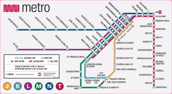 http://mappery.com/maps/San-Francisco-Muni-Metro-map.mediumthumb.gif
Finding one's way around an unfamiliar city can present a challenge. The best way to navigate through a big city is to use a map. A straight forward map that is exactly to scale can be even more daunting then just asking someone for directions. The San Francisco Muni System has condensed the map to its most essential information so that if one knows where they are and where they want to go, they can quickly and easily tell how to get around.
Navigating a large website
 http://www.treehugger.com/
Navigating a website can also be very confusing. Because of my interest in green design I decided to take a look at how one of the well known hubs for green thinkers (treehugger) has organized their navigation bar. As you can see, the various topics are organized into three categories: Get Informed, Interact, and Take Action. This hierarchical structure is broken down even further into subgroups. By organizing the information at the very top of the page the visitor does not have to waste a lot of time wading through information that does not relate to the purpose that they had intended. The information is quickly retrieved and navigation is a success!
No comments:
Post a Comment