Tuesday, November 16, 2010

Week 12 Blog Exercise / Visual Techniques

One of the areas of design I am very passionate about is green technology.

Below is a device that allows you to charge a usb appliance using the energy that you generate while riding a bike.
Descriptive Words:
Depth
Balance
Mechanicalness
Asymmetry
Economy


Next is a window blind design that absorbs solar radiation during the day and provides light at night with the stored energy.
Descriptive Words:
Regularity
Symmetry
Unity
Harmony
Simplicity


The two designs are both have been created with energy conservation in mind. The first was a device that has a compact and economic form so not to be too bulky for a bicycle rider. The window blinds are a simplistic idea: if you have to cover the window from the sun, why not get the benefit of the energy instead of wasting it? Both create a sense of depth. The bicycle unit while mechanical in nature, is asymmetric while still maintaining a feeling of balance. Each window blind is in unity with the other to make a regular pattern of blinds. This pattern gives harmony to the window and lends to a calming effect in eye of the observer.


Tuesday, November 9, 2010

Week 11 Contrast Blog Exercise

Lately I have found the online TED conferences to be a great way to hear really intellectual and inspiring speakers. Last time I visited the TED website, I was struck by a guy named Seth Godin who is an entrepreneur and blogger who thinks about the marketing of ideas in the digital age. In his speech he talks about his website, "This is Broken." For the full talk go to: http://www.ted.com/talks/seth_godin_this_is_broken_1.html I have used a couple of the examples from his TED talk slideshow to illustrate the good and bad uses of contrast.

Example 1: Effective use of contrast in Design
The example above humorously contrasts the attention of the dog to that owner. Its nice that the authorities in Vancouver have decided to take this approach. The place in the background is beautiful. Signage that normally would take away from the serenity of this scene instead lends to it's charm.


Example 2: Poor use of contrast in Design

What was this guy thinking? This shows a broken design in action. The important information "that the bridge is out ahead" is in small print, while the "sharp edges" of the sign seem to be where the major emphasis is being placed. The contract between the largeness of the text describing the sharp edges and the small text about the bridge does not communicate where the true danger lies. Contrast is suppose to alert us to what is important. If one uses it in counterintuitive ways they risk being misunderstood.


Tuesday, November 2, 2010

Week 10 Navagation Blog Exercise


Navigation

As a visual designer its important to see the big picture and be able to convey that knowledge in a clear and precise way. Below are a couple examples to demonstrate this.


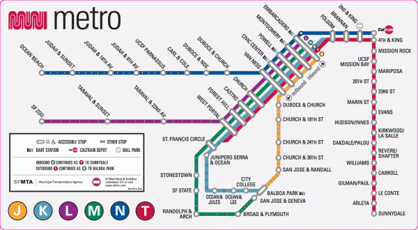
Navigating our complex transit system
http://mappery.com/maps/San-Francisco-Muni-Metro-map.mediumthumb.gif

Finding one's way around an unfamiliar city can present a challenge. The best way to navigate through a big city is to use a map. A straight forward map that is exactly to scale can be even more daunting then just asking someone for directions. The San Francisco Muni System has condensed the map to its most essential information so that if one knows where they are and where they want to go, they can quickly and easily tell how to get around.

Navigating a large website
http://www.treehugger.com/

Navigating a website can also be very confusing. Because of my interest in green design I decided to take a look at how one of the well known hubs for green thinkers (treehugger) has organized their navigation bar. As you can see, the various topics are organized into three categories: Get Informed, Interact, and Take Action. This hierarchical structure is broken down even further into subgroups. By organizing the information at the very top of the page the visitor does not have to waste a lot of time wading through information that does not relate to the purpose that they had intended. The information is quickly retrieved and navigation is a success!